Maximizing Your LinkedIn Header Graphic

I bet you can eek out more space.
One of the major mistakes I see people make on their LinkedIn Profiles not exploiting the header graphic. This is premium real estate. Most people waste it.
You have about 3 seconds to telegraph your value and capture a stranger’s interest on your website and I don’t see why it would be any different on your social media profiles.
What story does your header graphic tell about you? That you’re a digitally savvy professional or not? That you care enough about your appearance that you would apply the same thought and attention to the conservatorship of a major brand – or not? What message could you convey at the top of your LinkedIn Profile that doesn't require people to rifle through your work history to find out about you?
Polishing up your profile is easy. There are three main components to creating a standout header graphic.
Visual Components
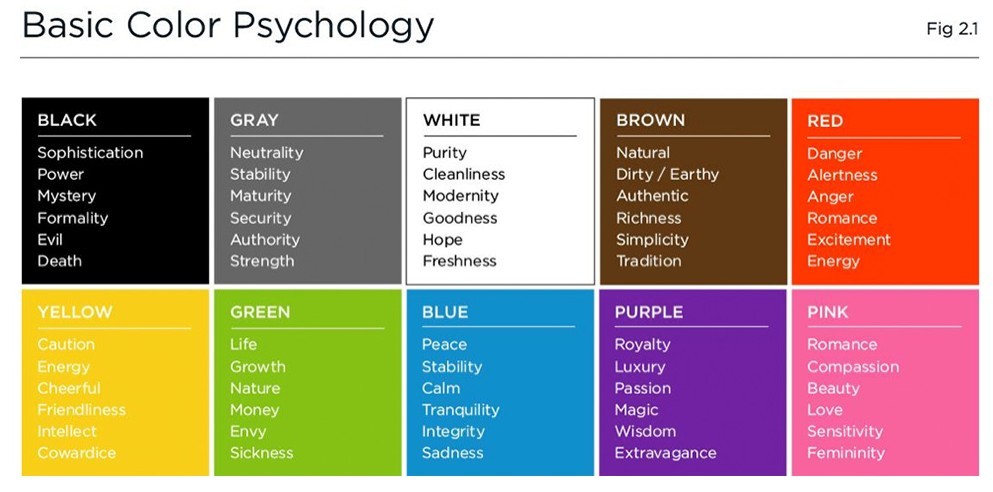
Color
Color should evoke the proper feelings from your intended connections or create associations between you and something you want to be known for. Like wine? Purples. Luck of the Irish? Green. Sunny disposition? You get the idea. Here are some common associations that exist for the different colors.
Style
Good design is more accessible than ever. I can write entire articles on this but suffice it to say that your LinkedIn header graphics design "style" should reflect your primary branding objectives. There are a couple of tried-and-true design styles you will find to be the most accessible:
Modern - Typified by the Swiss Style of graphic design, denominated by clean shapes and lines and legible typography.
Digital - Incorporates style elements that call attention to the fact that the graphic is created for the digital medium, including pixelation, transparent gradients, etc.
Edgy - I'm lumping a couple of different design styles into this theme, including "grunge" and "Bold."
Flat / Iconographic - You see this everywhere these days. While it might be one of the more accessible design styles to implement, it's also exceedingly common, so you might choose to adopt a style that stands out more.
Vintage / Florid - I'm a big proponent of the "what's old will be new again" philosophy of art and design. If done right, the vintage print, old west, or classical styles can render your brand in a highly distinctive and differentiated way.
Graphics
The images you choose for your LinkedIn header can feature a single subject or a selection of them. I encourage you to choose photographs or images that you feel a connection to, whether it be a person, place or thing and whether it is represented as an appealing photograph, graphics rendering, or collage of things.
Unique Selling Proposition or Positioning Statement
The art of creating a winning LinkedIn Profile header graphic doesn't stop at the visual appearance. Selecting text for your header graphic is also an art. We'll go into some basic guidelines but, by all means, exercise creative license with all aspects of your brand.
1.) Prepare your basic value statement:
Basic Formula: [Your Ideal Connections] [Problem] [Unique Solution]
In other words: Who you help, what problem you help with, how you help them uniquely.
Example: I help [executive leaders] [transition to new jobs], [discretely and confidentially]
2. Say it differently as well.
Here are some of my go-to methods for "saying it differently" and approaching the content of your value statement from a slightly more interesting angle:
Axiomatic - "There are no prizes for second place." Associate your brand with a truism that most people will agree with. If it goes without saying... go ahead and say it.
Themed - "Arm yourself to win in the executive search arena with cutting-edge strategies." Ok, the distinctly competitive theme should be obvious. The world is replete with metaphors and themes that can boost the telegraphic quality of your brand.
Colloquial - "Get back into the game with your pride intact." Using colloquial expressions is an old copywriters' trick. The idea is to talk about what you do in everyday terms.
3. Mind your economy of words. Distill it down to its bare essence.
You're going to find out real quick there's only so much usable space in your LinkedIn header graphic and that you probably won't be able to fit as much text as you want. Brevity is the soul of writing for the web. Here's are some examples of what to do and not to do.
This: Executive Outcomes
Not This: Innovative Strategies for Extraordinary Results
This: Corporate Warrior
Not This: Indefatigable, corporate aspirant with ambitions of superior performance.
There is an art to this and there are no right answers in the world of personal branding. Adopt the metaphors, themes and motifs that resonate with you and you believe will successfully communicate your brand.
Call to Action
The third and final important element of your LinkedIn Profile's header graphic is the call-to-action. This can be simply stated in your text and reinforced with graphic elements or otherwise suggested in the overall composition of your header graphic. Here are some different options for expressing your call-to-action or "most wanted response."
Read my profile
Connect with me
Let's do coffee
Follow a Link (Use a shortened link if calling attention to a specific page.)
Find me on _________ (I like this one because it makes them go look for you on some other venue)
Contact Me (Boring, but effective)
Phone Number
Email Address
Don't let your LinkedIn Profile header graphic go to waste. I hope that this article has given you some ideas to consider.